CurrentLY App
This project originates from a semester-long group project in which we collaboratively designed and developed a high-fidelity prototype of an innovative app. Our team created a detailed prototype for a new platform aimed at providing millennials and Gen Z users with reliable, fact-checked news. At the same time, we ensured that the platform retained the engaging social media features that initially attract these generations, blending trustworthy information with familiar social interaction elements.
Year
2024
Class
UX Design
Phase 1
Problem Statement

“Gen Z and Millenials are more likely to use social media for news. However, because social media is an open platform, most news on social media can be unreliable and unverified. We are focused on creating a new platform that will provide millennials and gen z with reliable, fact checked news while maintaining the aspects of social media that are attractive to these generations in the first place.”
Although our opinion of the problem and how to solve it developed throughout the project, our initial thoughts were to focus on the fact checking aspect of news. We thought because the problem is receiving unverified news, the solution is to simply add an algorithm that would fact check news. You will see in the later phases why we decided to change that and ask bigger questions about how we receive news and form opinions.
Interview Data
We did 3 interviews, 2 were Gen Z and one was Millennial. They all cared about different aspects of the news in varying levels of interest, but they all consumed news one way or another. These interviews heavily influenced our design. Because of the preference toward apps, sharing, friends and personalization we decided to combine your traditional news site with a social media app. This process confirmed some of our previous ideas about what the user needs, for example, credibility. But it also made us realize this app must be more than just news. We realized that our interviewees did not regularly seek out the news because most of the time, it would happen upon them on social media. Sometimes, they would travel outside of the app to check other sources but not always. They would instead send the content to friends and check the comments to form their opinion. Then came our idea to make it unnecessary for the user to travel outside the app for more sources.

Personas and Journey Maps
Our user personas really pushed us humanize the data we had collected even further. We created “Laura Thompson”, a 20 year old business student looking to see local, personalized news that she can share with her friends. She needs the option to filter, search, and share. She is exhausted from “bad news” and having to leave her apps to check more sources. She likes being informed for her classes, being aware of local events and being aware of business politics. Additionally, we have Millennial Yvonne Treeson. She is a 38 year old Engineer living in NYC. She wants to have more free time but also stay informed on current events and share them with her family. She needs investment related news to help her with retirement, easy to use technology and global news to stay updated on things related to her work. She is tired of confusing headlines, managing her stress and conflicting information. She is interested in human rights, retirement, new foods, cats and community. Both of these personas encapsulate different kinds of users who may want to use our app. It helped us discover what a user would do upon opening the app and what expectations they would have.

Phase 2
Mood Board and Style Guide
The app's mood and style will feature a bright and vibrant color palette with a clean and modern layout. Feedback from interviews highlighted dissatisfaction with traditional news platforms, which are often perceived as dark, heavy, and confusing. Interviewees described these platforms as mentally draining due to their perceived biases. Instead, they emphasized a preference for a happier, more uplifting atmosphere, with options to personalize news topics and easily verify information accuracy. A sense of community and connection with both the news and other users was identified as essential for engagement.
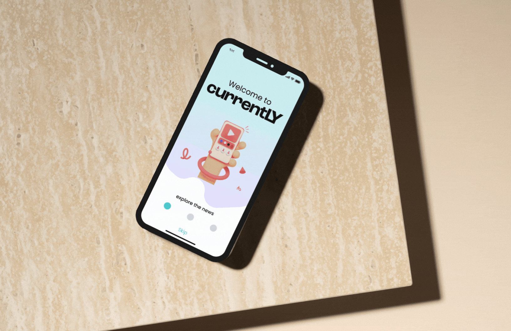
To align with these insights, the app's backdrop will feature light, cheerful colors such as purple, blue, and orange. The introductory pages will include affable, visually appealing images paired with engaging taglines. The typeface Poppins was selected for its simplicity and readability. The app is named “Currently,” reflecting both its focus on today’s events and the concept of news flowing seamlessly like water. This name, along with the overall design, aims to create a fresh, light, and approachable vibe that resonates with millennial and Gen Z audiences.

Sketches and LoFi Wireframe
The preferred method of consumption of information per interviewees is through the utilization of apps. For the app, clear and easy usage with intuitive navigation is the objective for the overall design. The search feature will be clearly visible in the app for ease of the user. News articles and videos that is trending will be displayed on main page. Secondary page will be available for user preferred subjects. Readily available verification or sources option for each news article or video. Connectivity options for users to share, post, community chat, ability to follow other users, and direct messaging. A scrolling method will be used for article results with background or heading color to delineate featured articles versus user preference articles and community/friend pages. The compilation of the information and features should be cohesive and straightforward for the user.


Internal User Feedback
User feedback on the app was overall satisfactory with the need to clarify certain feature buttons for more intuitive navigation. The following is some of the suggestions and comments were provided. 1. The name of the app is “currently”, with “LY” in capital and the commentary was it looks out of place. 2. Introduction page can also benefit with a mission statement or tag line of app’s purpose. 3. Filters and sort for results was suggested for all pages. 4. Layout for back button, more spacing between magnify glass bar, bigger pictures for articles were suggested. 5. Local news not apparent under “My Current” feature. 6. “More button” unclear that is shows additional sources/other coverage. 7. Differentiate between verified versus unverified sources. 8. A cute shark icon for the app.

Phase 3
HiFi Prototype
Our HiFi prototype emphasizes functionality and presentation, incorporating the colors and design elements from our mood board. We refined the layout and features to align with our goals, including key functions like search and social features.
User testing showed significant improvements over the LoFi prototype, with testers praising the interface's clarity, style, and simplicity—an aspect that wasn’t fully captured in earlier versions. While features like the ability to search additional sources directly within the app support our mission, presenting these innovations clearly to new users remains a challenge. Overall, the HiFi prototype effectively showcases our vision for a user-friendly and visually appealing app.
This project provided valuable insight into the design process from a creator's perspective. We learned to balance our ideas with user needs, finding ways to visually communicate functions and create something users didn’t realize they wanted.
A key takeaway was the importance of early testing to uncover user preferences, even those outside the initial scope, such as the need for information sharing. This reinforced the value of human-centered design in crafting stress-free, inclusive experiences that address real-world needs.
Overall, the project taught us to approach problems holistically, challenge our assumptions, and think from multiple perspectives. By stepping outside our echo chamber, we developed a better understanding of how to design meaningful, impactful solutions. These lessons will guide our future work and creative thinking.
Conclusion

