
Lamar
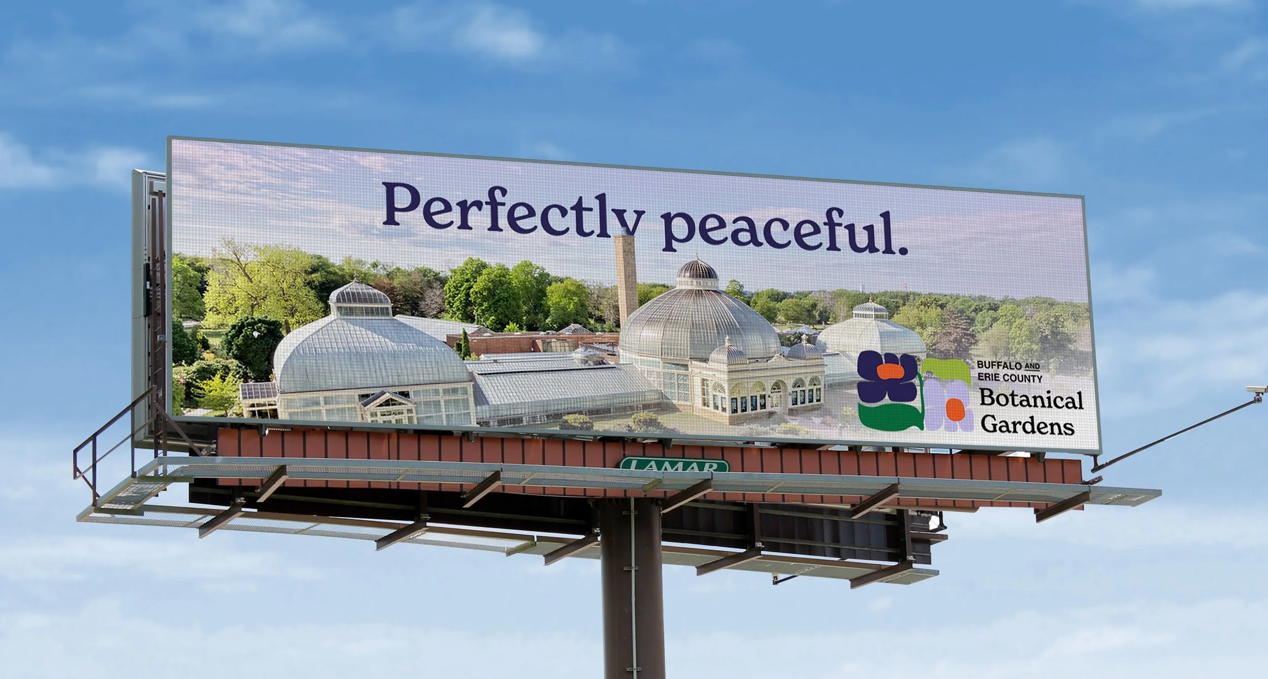
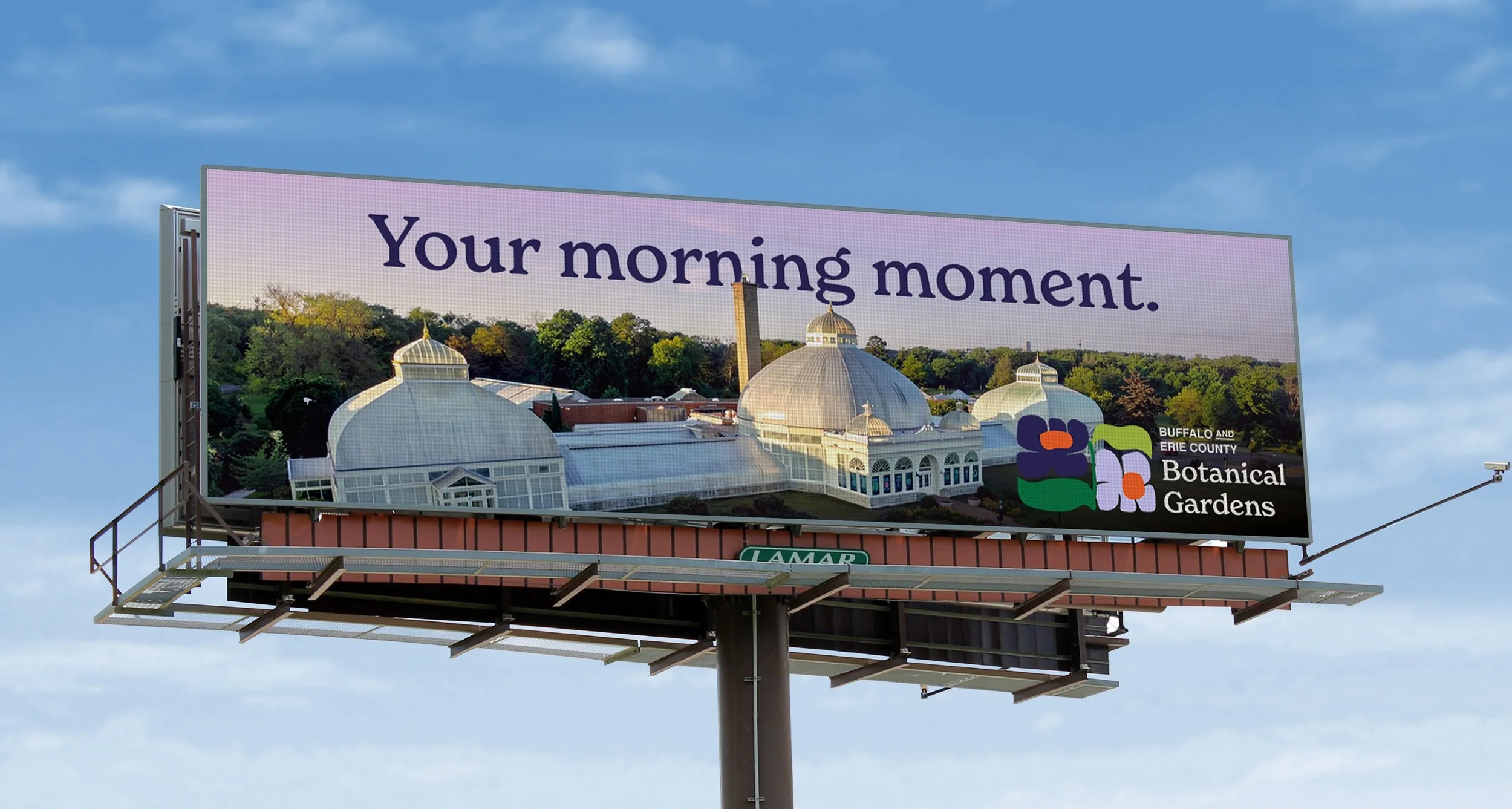
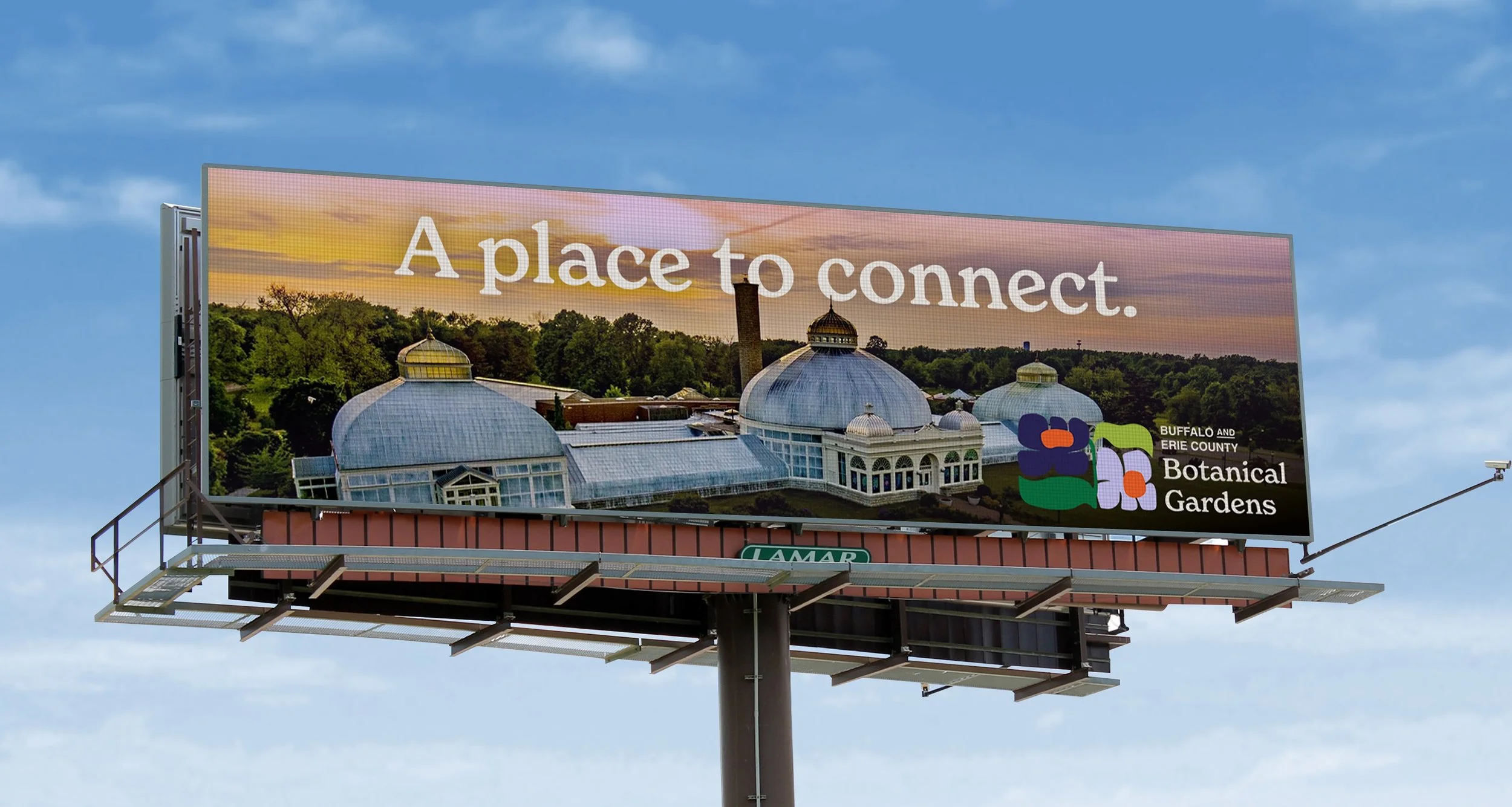
Designing for Lamar taught me the power of clear, impactful messaging. Drivers traveling at 60+ mph have roughly six seconds to register a billboard, so every design choice must be concise and immediately readable. It’s vital to take into account the location, viewing angle, and how long people will actually see the board, and prioritize a short, memorable tagline paired with striking, easily understood imagery.
Botanical
Gardens
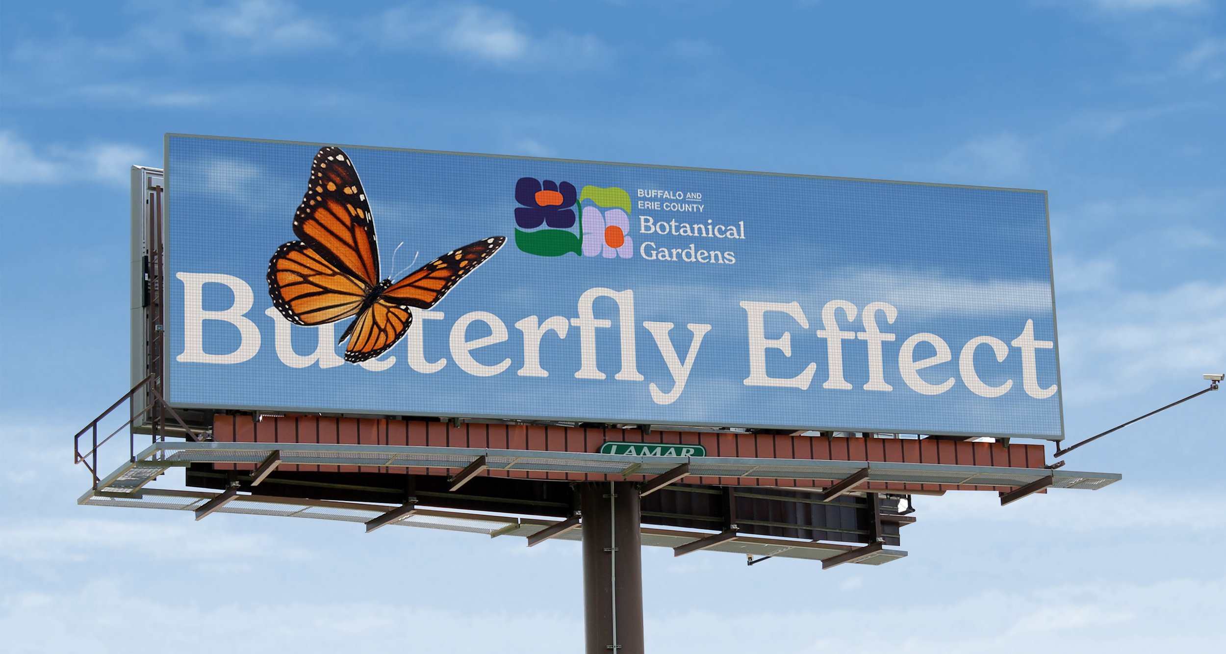
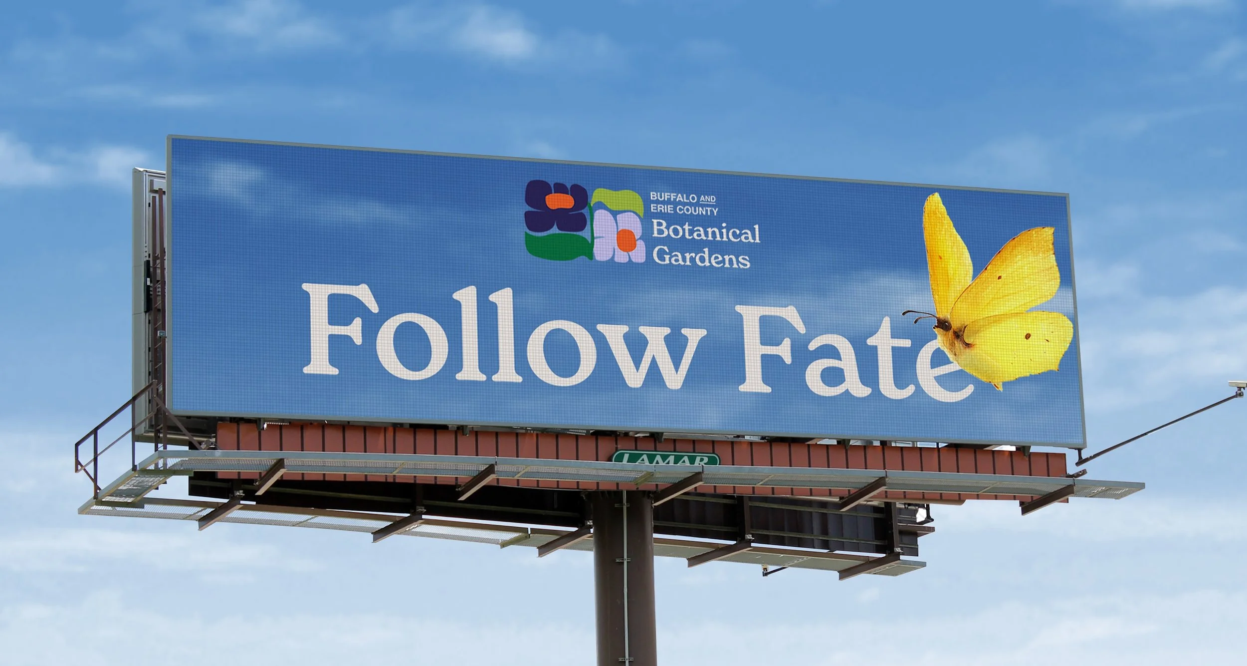
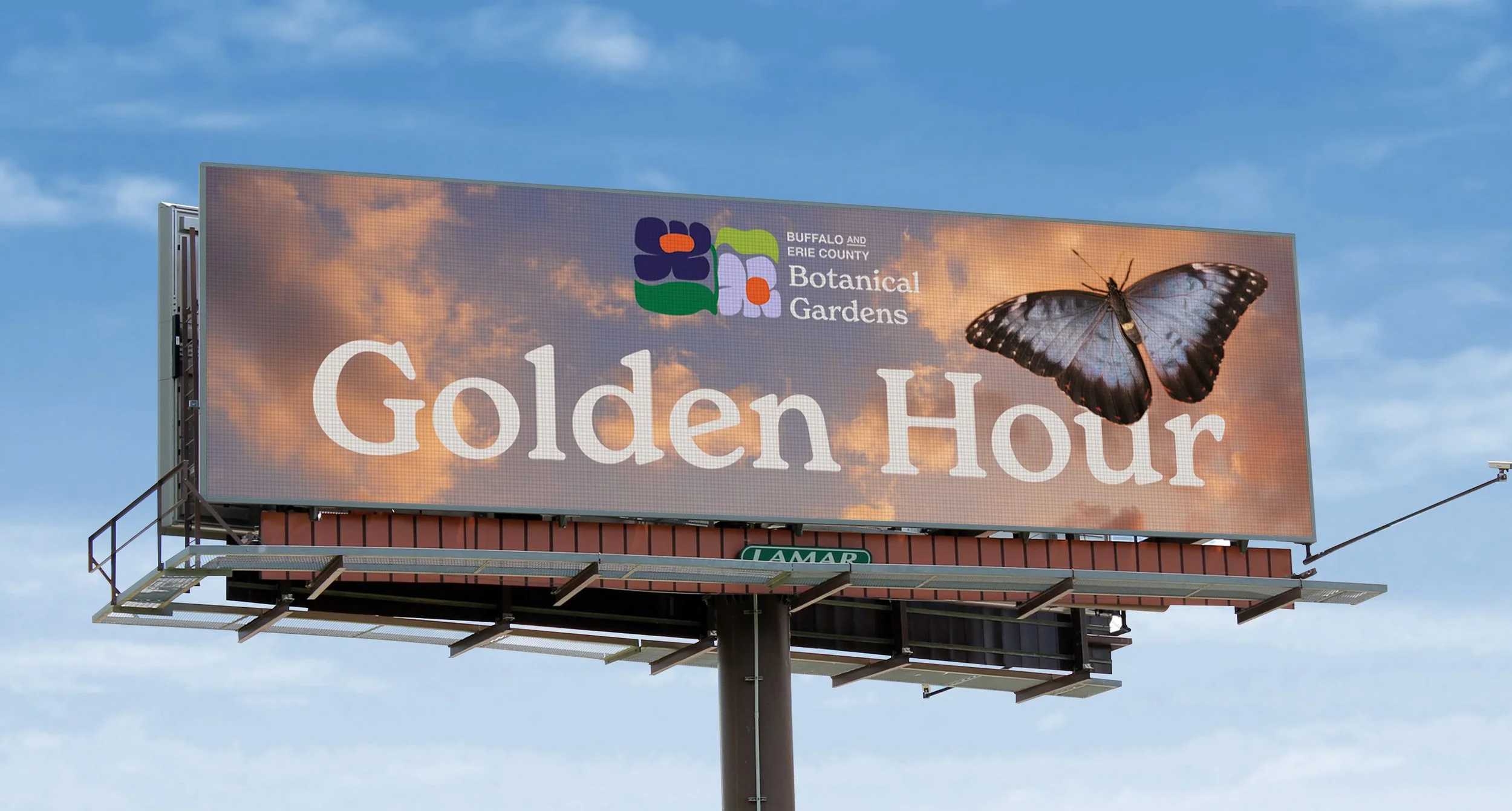
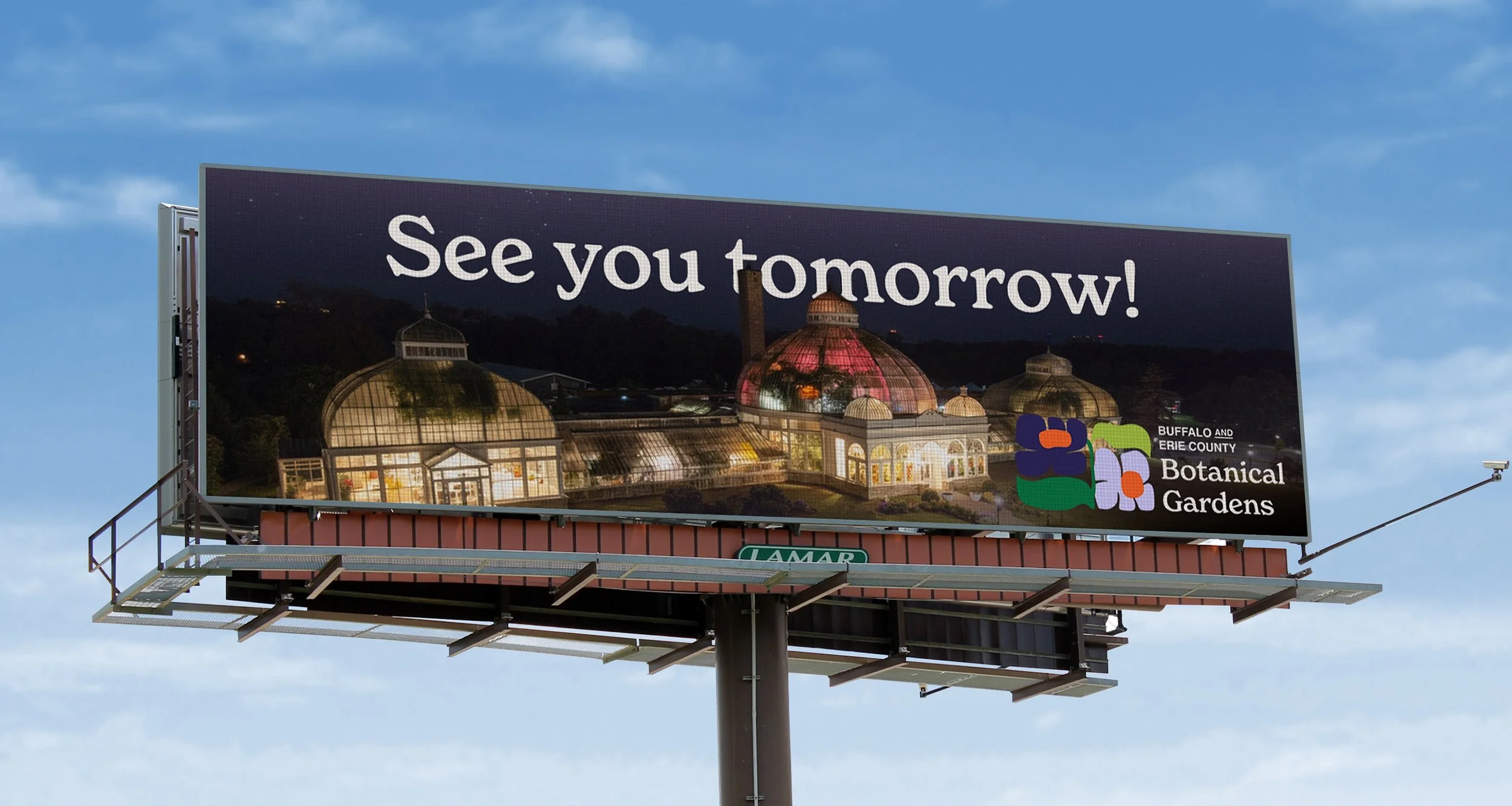
This may, I created a dynamic digital billboard campaign for the Buffalo Botanical Gardens to drive visits to their butterfly exhibit while highlighting the building as a local landmark. I leaned into their trendy, cohesive branding and clever time-of-day scheduling, using fun messaging that made each board feel like a literal "sign" to come check them out!
Date
05/29/2026
Sabres
Self Promo
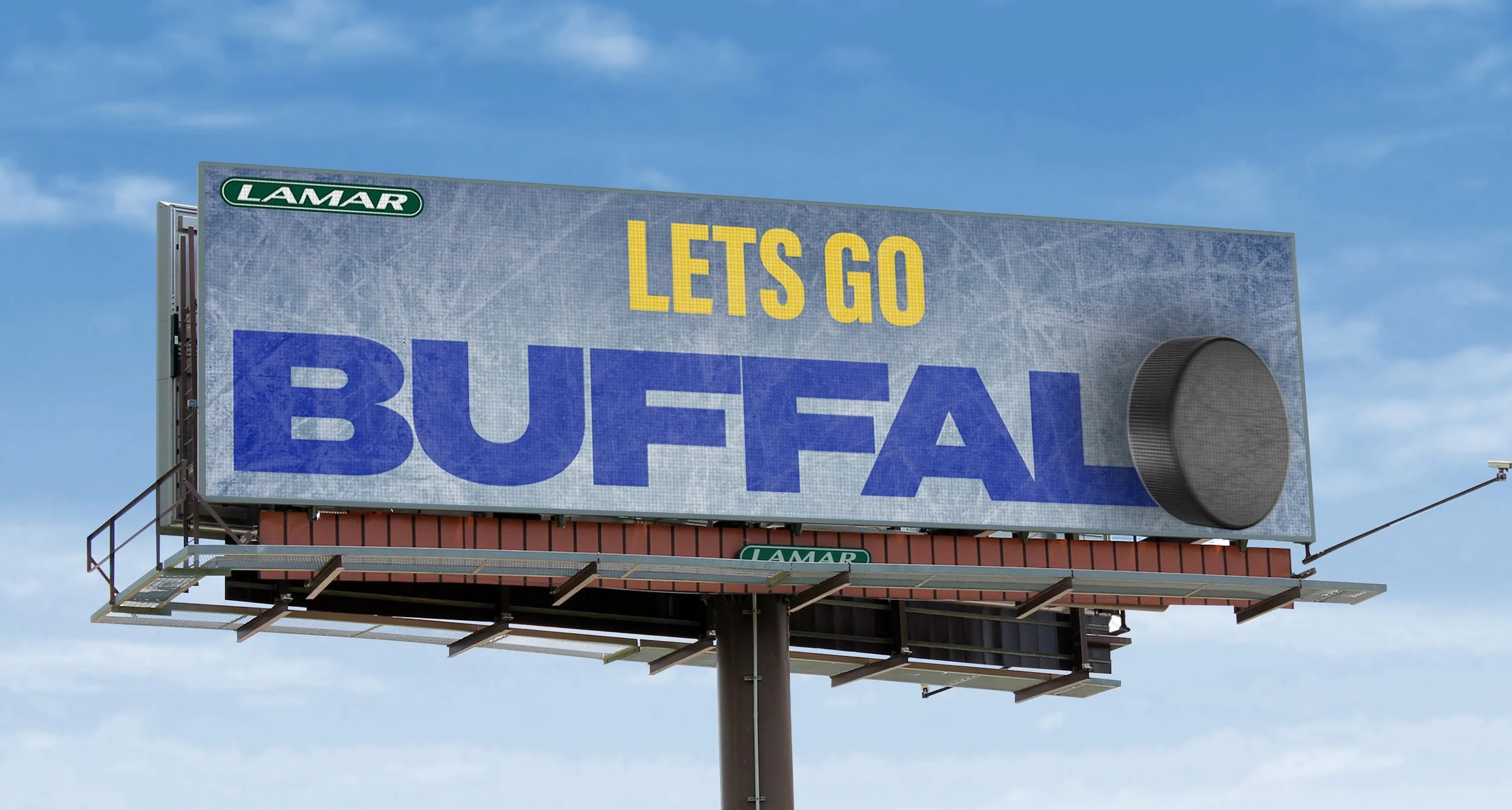
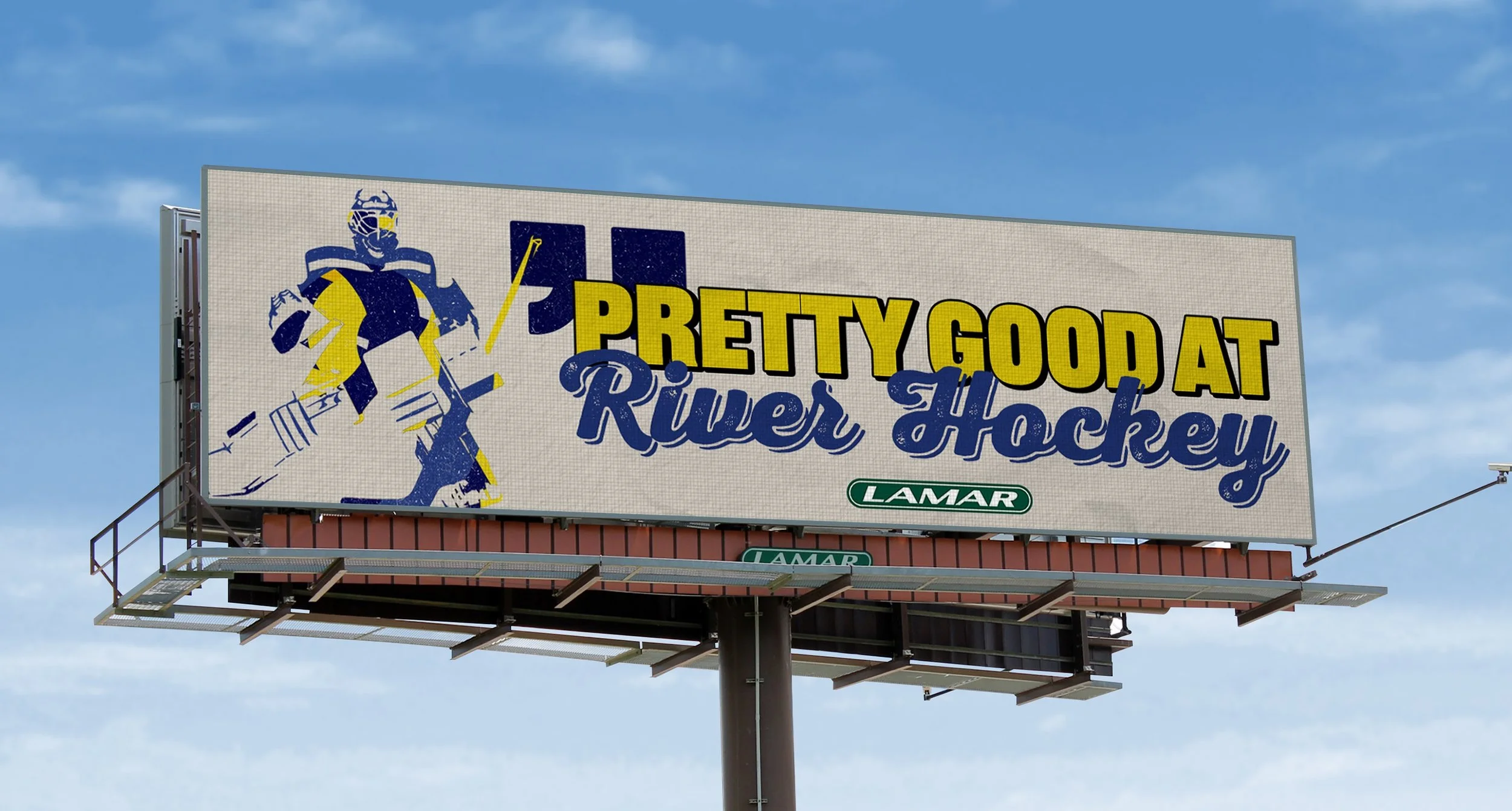
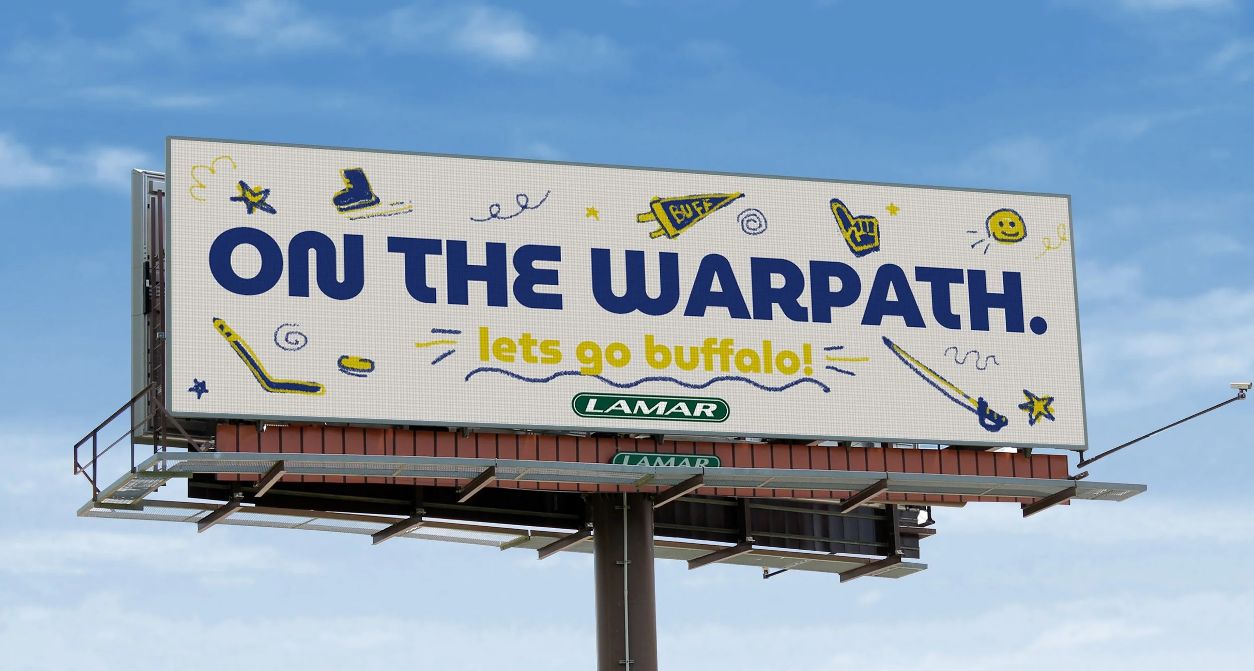
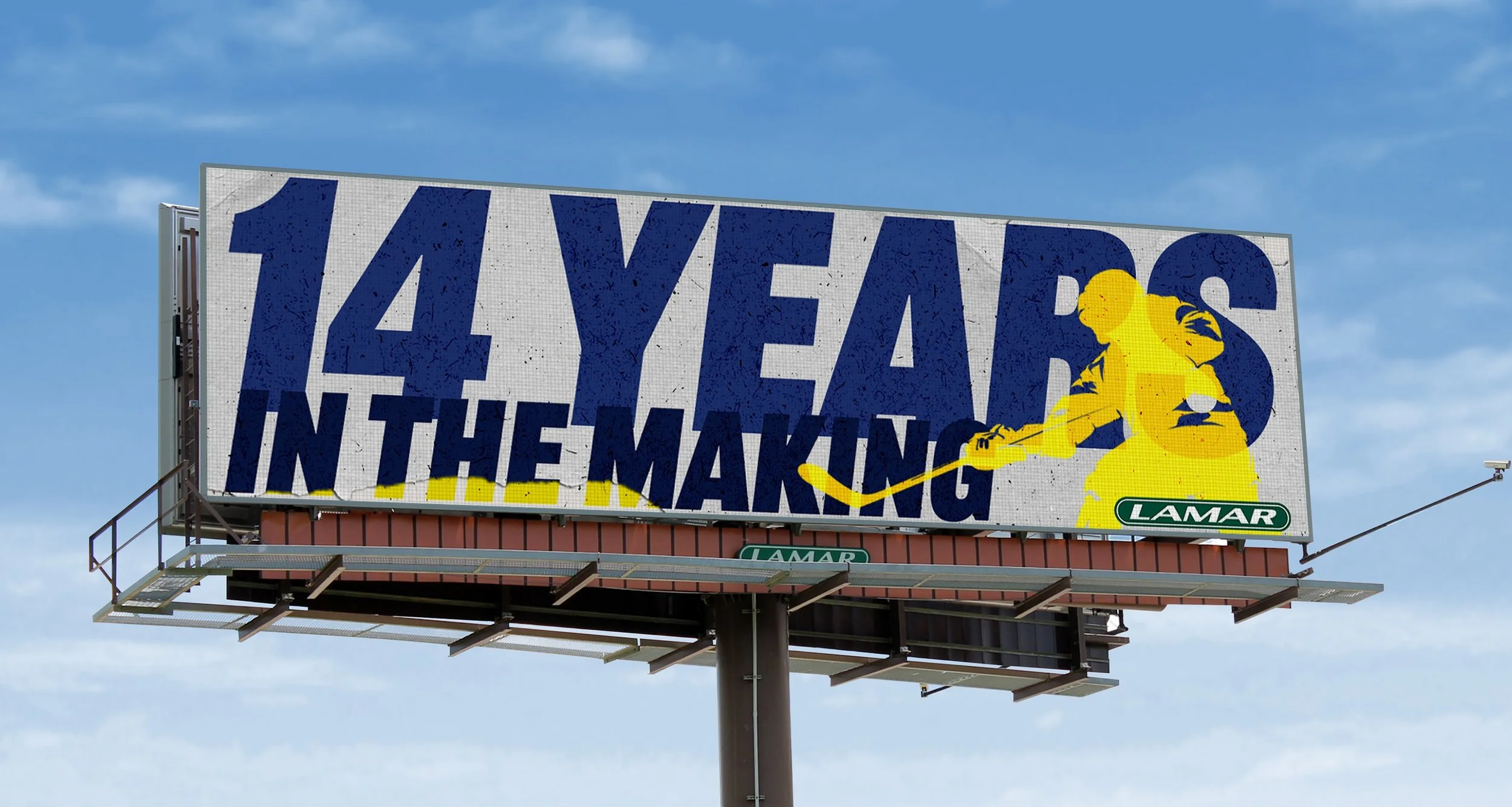
How do you show Buffalo that you’re a company that cares about its culture and people? By showing up for our teams!
When the Sabres made the playoffs for the first time in 14 years, it was a monumental moment for the community. Since we weren’t an official sponsor, I had to be careful and clever. I dove into trademark guidelines and scrolled on fan subreddits to tap into the local hockey culture. As a lifelong Sabres fan myself, I was up for the task.
The result was rewarding: higher social engagement, buzz among fans, and more sales. All because caring about Buffalo isn’t about telling people you care, it’s about showing them.
Date
04/13/2026
Second Gen
Theatre
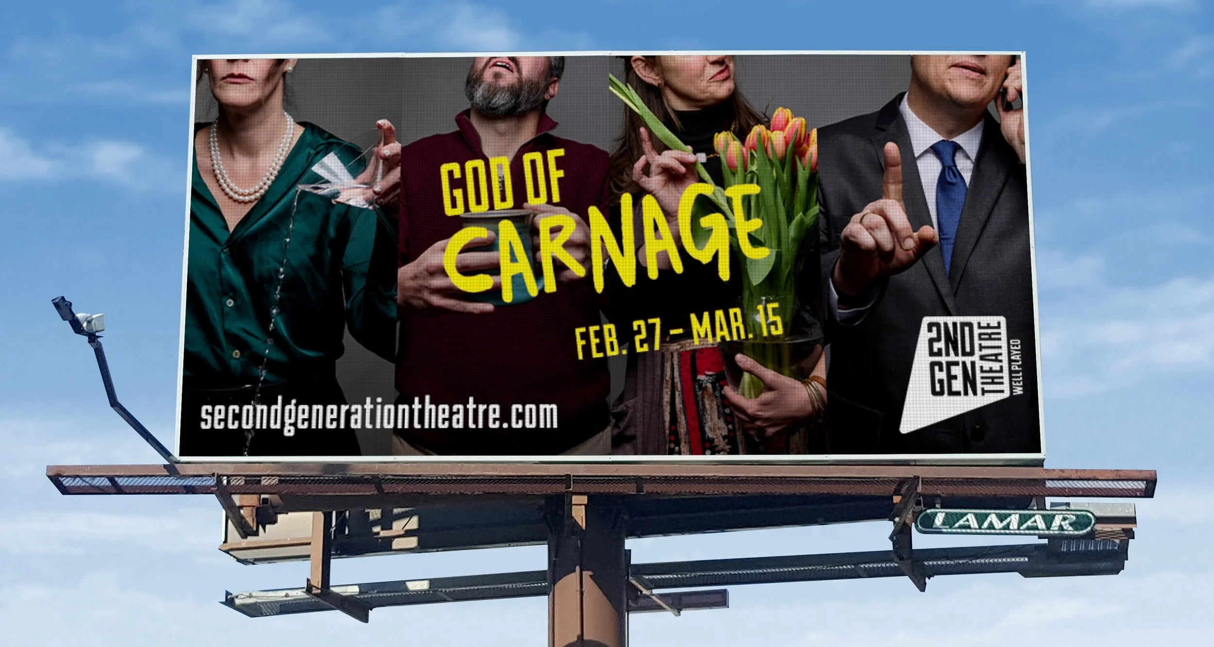
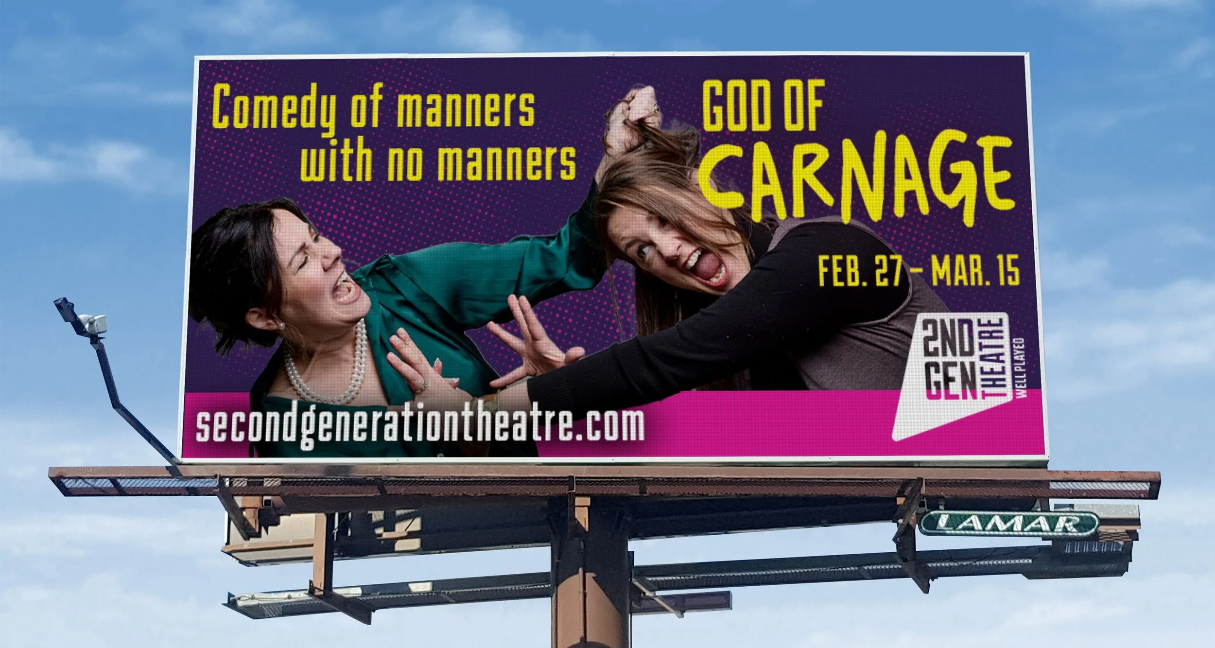
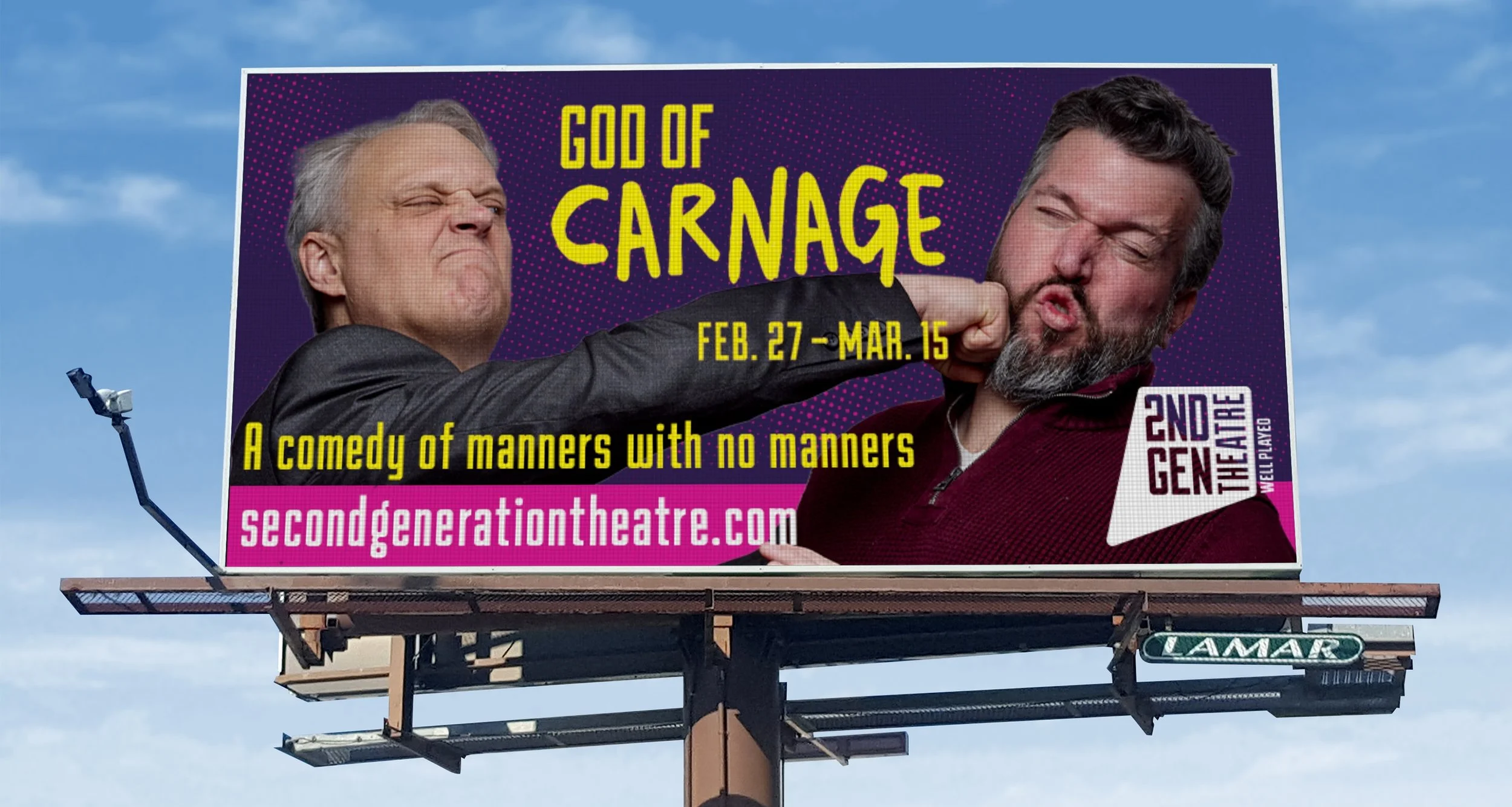
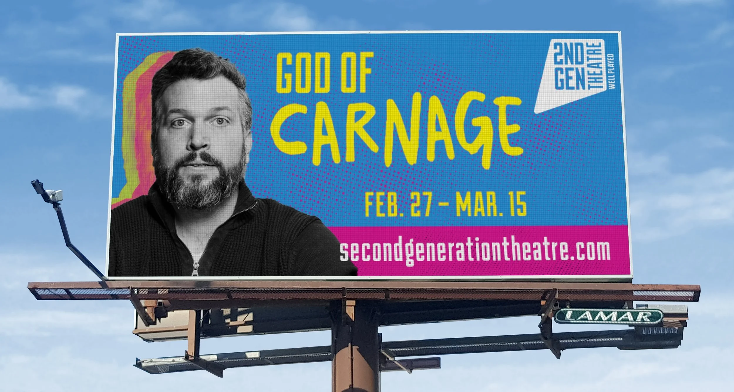
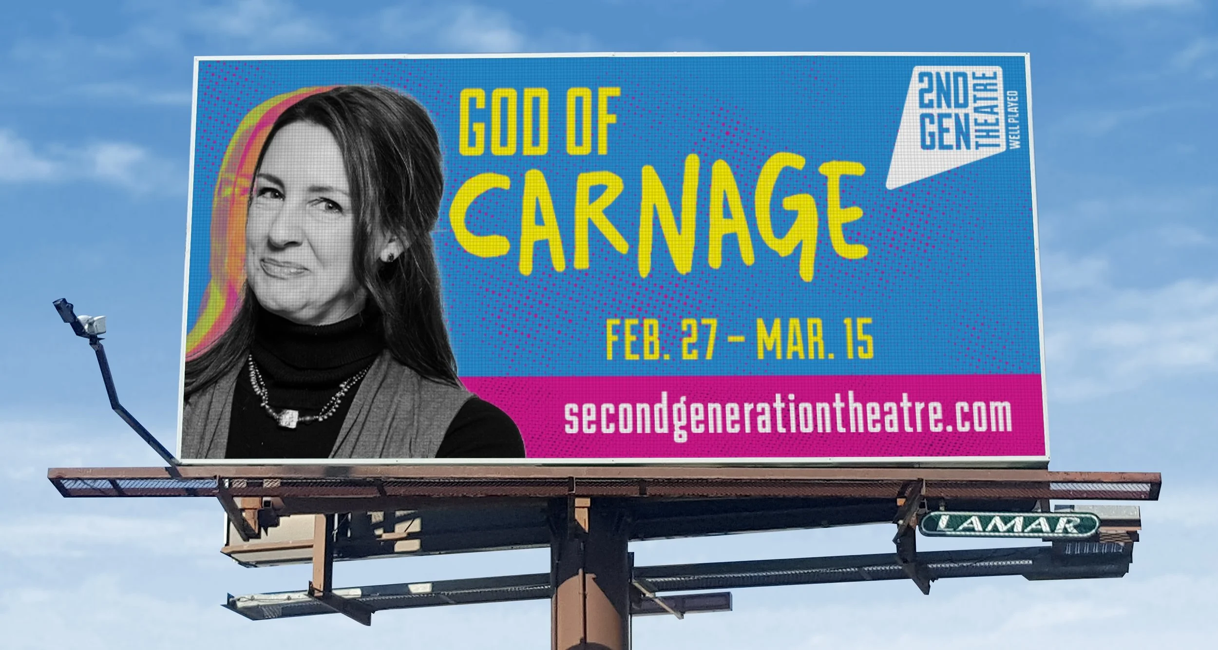
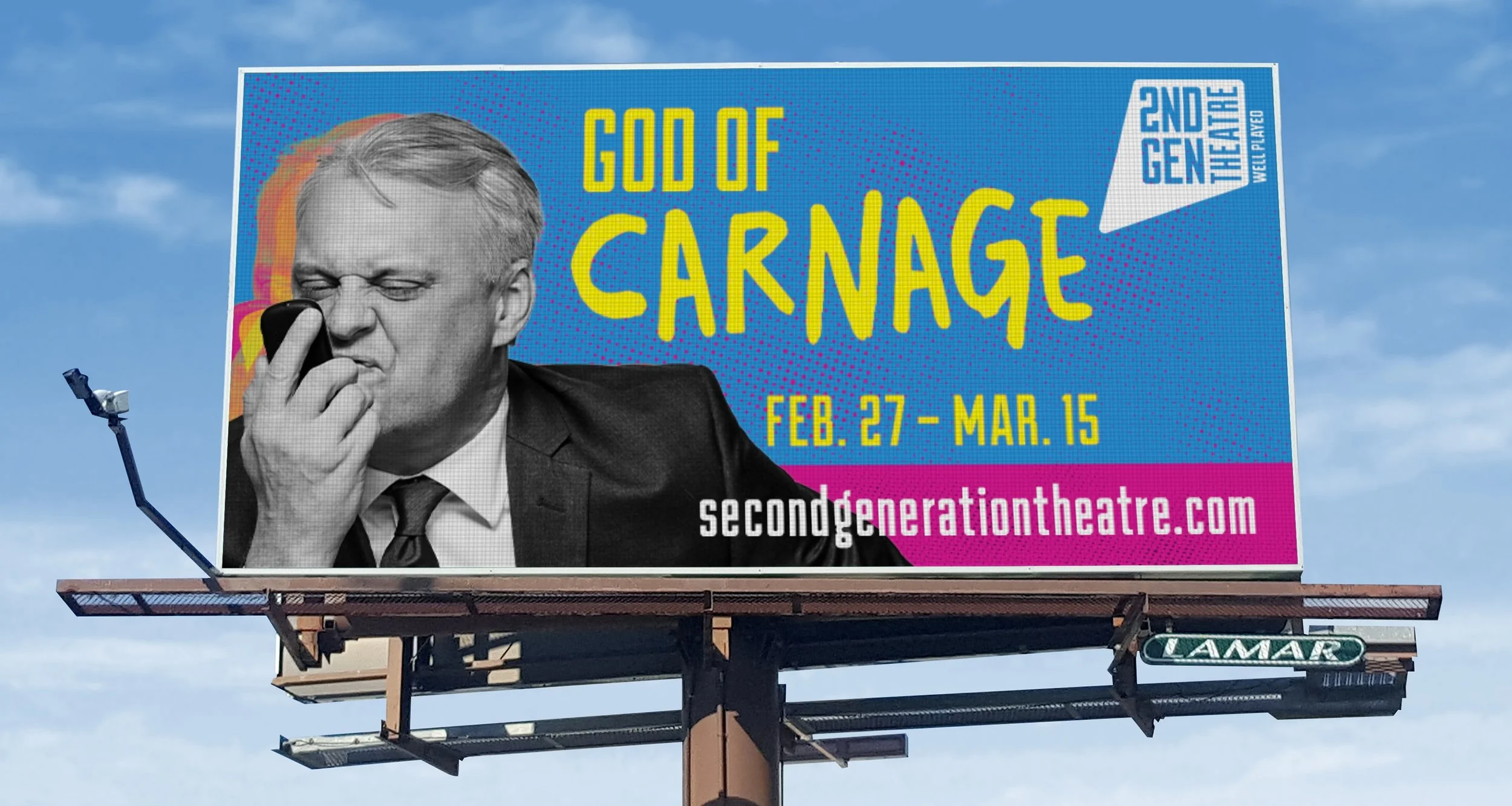
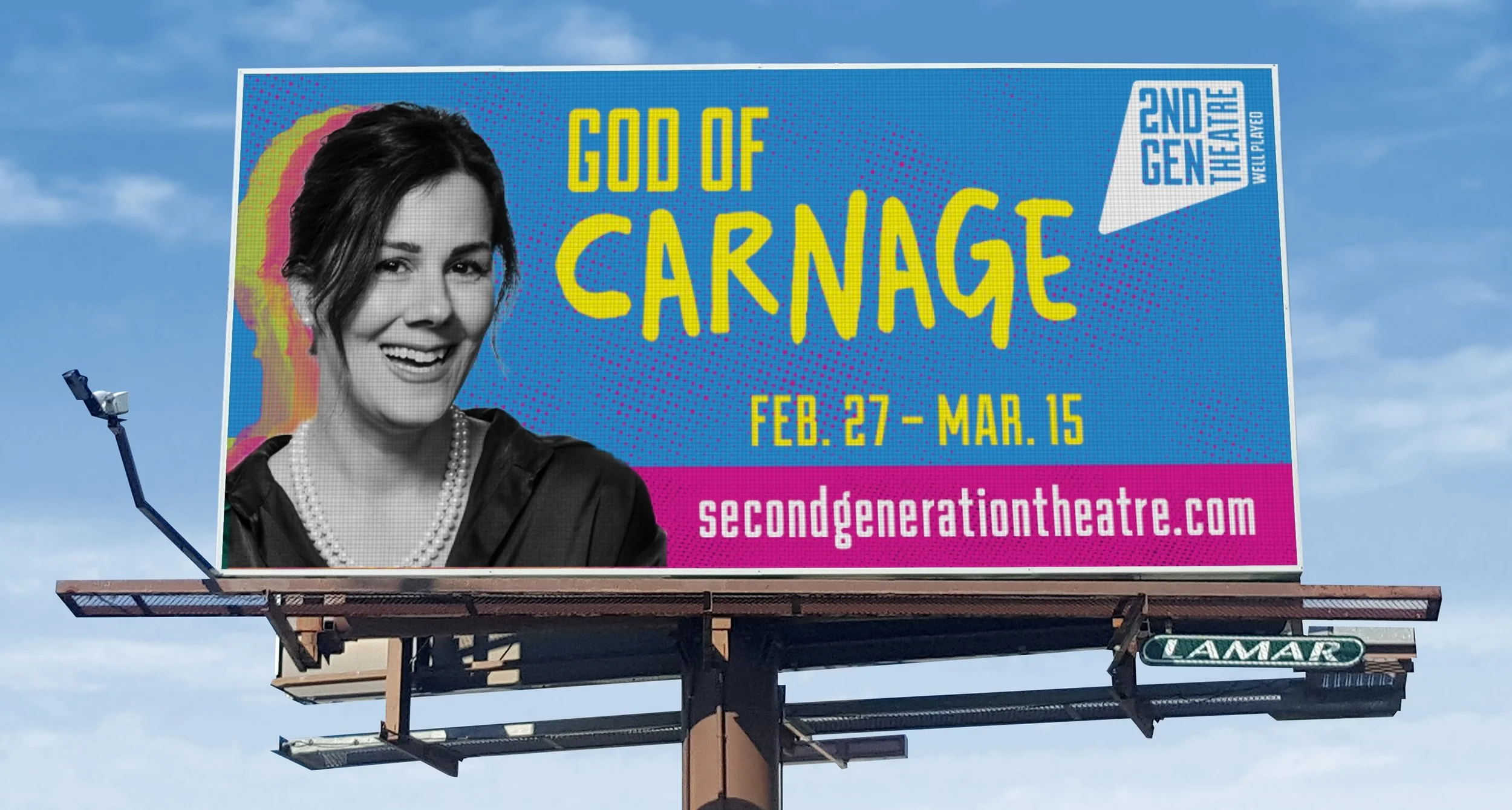
Design is rarely a straight path; where a project begins is often far from where it lands. Working with Second Gen Theatre was a prime example of this collaborative evolution.
Our process began with bold, high-contrast visual concepts that prioritized each actor as an individual focal point. However, through thoughtful iterations and creative compromise, the narrative direction shifted. We moved toward a more cohesive, grounded aesthetic—embracing dynamic character pairings, refined color palettes, and clearer, more accessible storytelling within the graphics.
Navigating multiple revisions and aligning on key information resulted in a final product that truly resonated with the client and their audience. The team was thrilled with the outcome, leading to an ongoing partnership to design promotional materials for their upcoming productions, Pure Glitter and Bat Boy.
Date
02/12/2026
VS. How it Started…
Rivergate
Academy
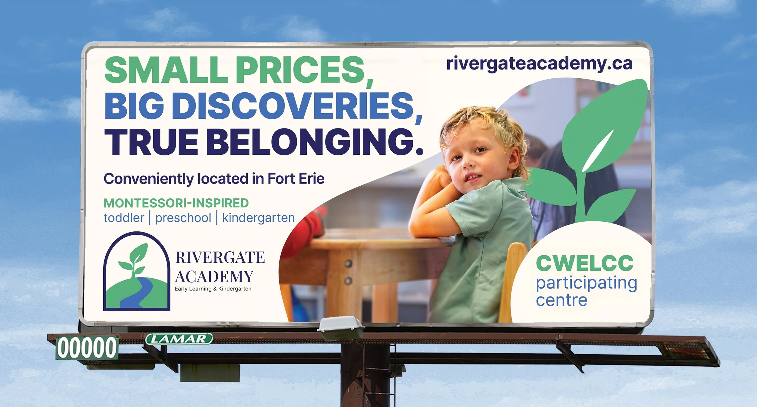
For this board in Fort Erie, Canada, this project required balancing key themes: affordability, trust, and authentic Montessori principles. Drawing directly from their existing brand guidelines, I created a cohesive design that feels like a natural extension of their values. The final layout captures both sides of their learning environment: a calm, nurturing haven for growth and a vibrant space for active discovery.
Date
07/08/2026